Redesign and document a design system for a multi-agent system desktop application.
Overview
The Information and Decision Sciences Branch at the U.S. Naval Research Laboratory tasked me with improving the user experience of their multi-agent system (MAS) product by reimagining how its users engage with the application. Considering the dynamic nature of the product and its diverse use-cases, the aim of the redesign was to reduce the barrier to entry for new users. The project included thorough product consultation, auditing, product design, complex multi-stage user journeys, and developing a design system.
Date
October 2022 – December 2022
Skills
User flows, User journey maps, Design System, Creative direction, Cross-functional collaboration, Marvel Prototyping, Desktop design
Role
Principal Interaction Designer
The Challenge
Simplify the navigation, comprehension, and interaction of a highly intricate dynamic multi-agent system.
Design Process
Requirements
The initial inquiry I made about the project centered around its requirements. Establishing clear requirements was a fundamental step in devising a viable solution. This process enabled me to uncover any technological constraints that would shape the system.
Product Audit
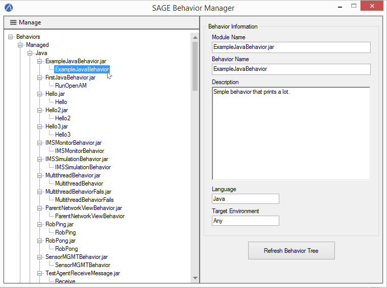
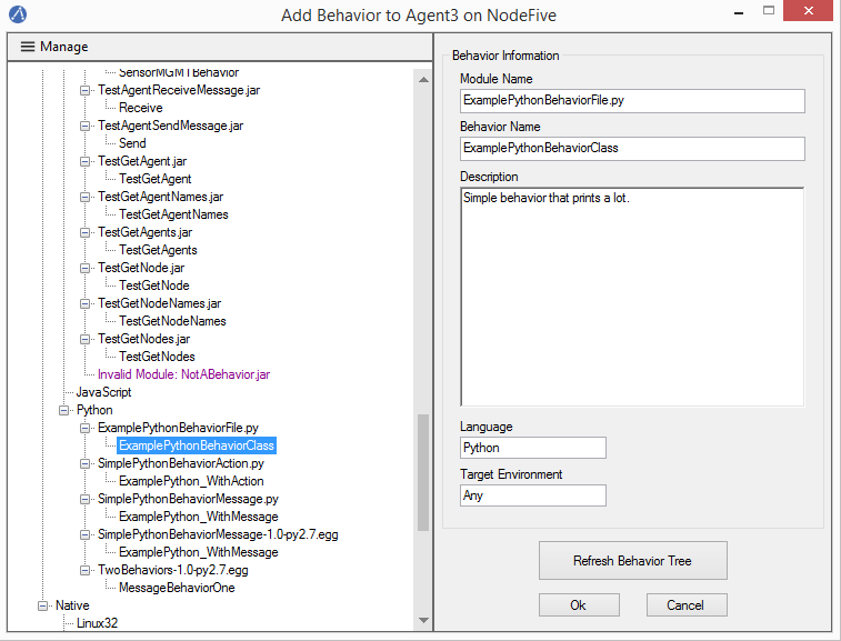
I focused on trying to understand the problem space the product was intended to address during the early stage of the audit. I compiled a list of findings pinpointing areas for improvement across different facets of the system, ranging from visual hierarchy to search navigation implementation. These findings were shared with the developers to seek additional clarification and served as a foundation for guiding future discussions.
User Behavior
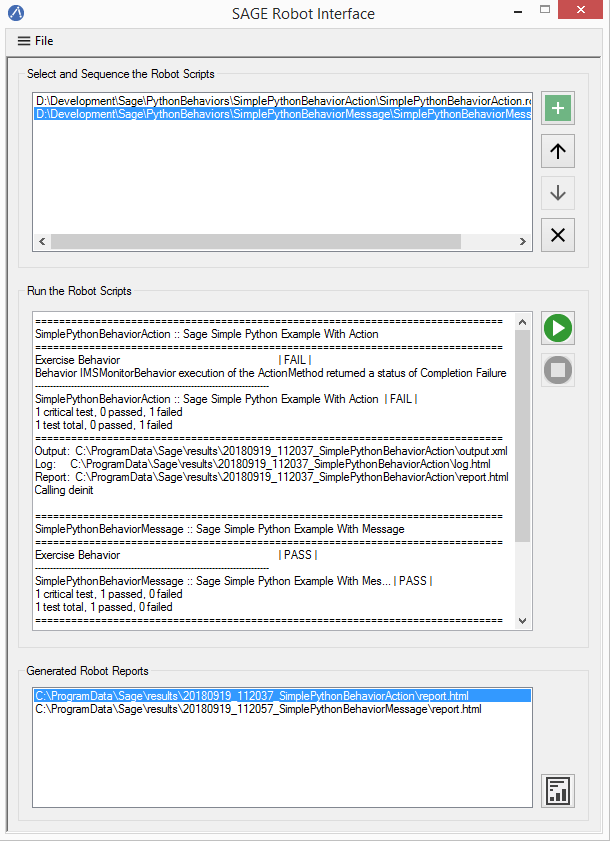
Gaining insights into the most frequently utilized features was important for understanding the user base. This was achieved through journey mapping. I found that though the users come from diverse domains, the product’s primary purpose remained consistent: facilitating the creation of a software agent network without requiring users to resort to terminal commands for agent control. Based on this premise, I categorized all existing functionalities into primary, secondary, or tertiary roles relative to achieving this overarching objective. This was necessary for introducing visual hierarchy to the product.
Ideate
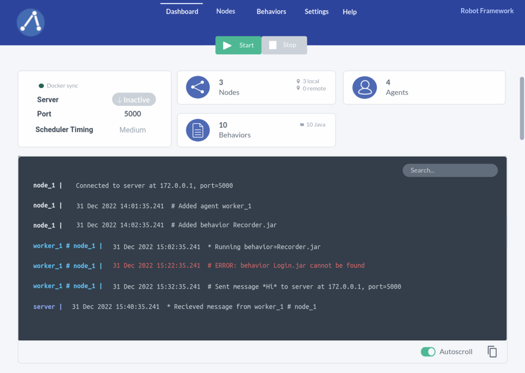
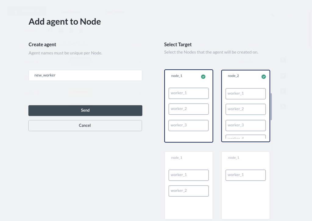
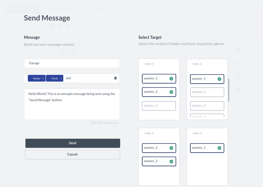
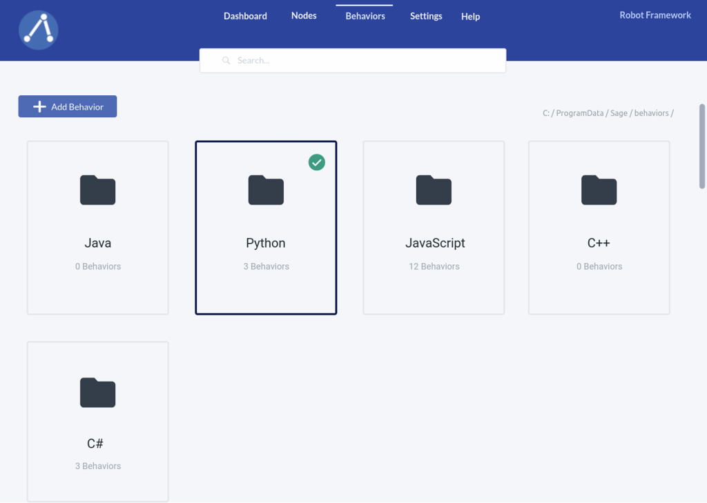
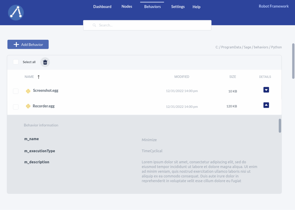
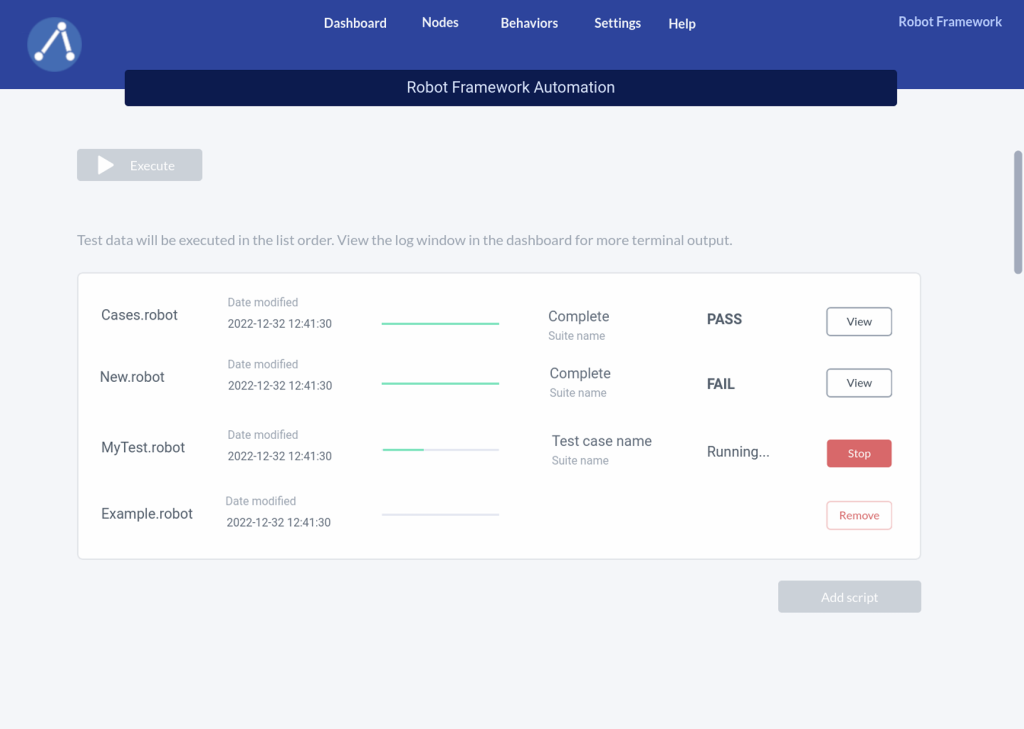
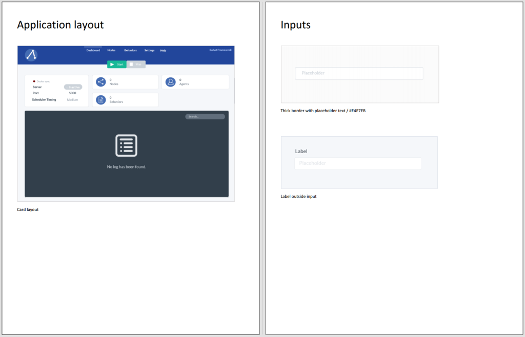
My goal was to enhance the visual clarity of the interface starting with redesigning the layout, ensuring that new users could easily understand how to interact with the product. While I considered several ideas, I eventually opted for a card layout that neatly segmented the core components of the system. My rationale was to provide users with clear distinctions between interacting with a “Node/Agent” or a “Behavior,” facilitating easier navigation and comprehension of the product. I compared time on task using a wireframe and the few workflows I had drafted.
Hi-fi Prototype
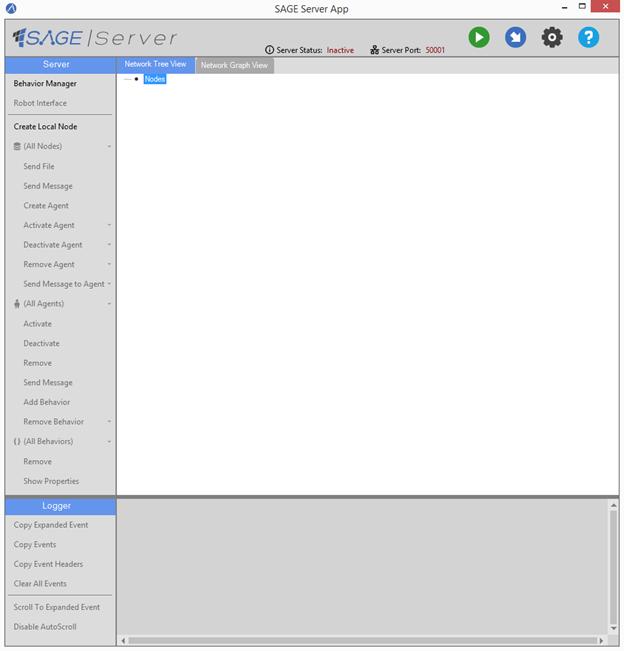
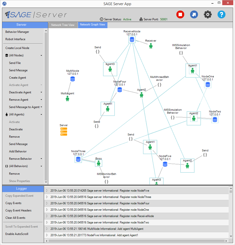
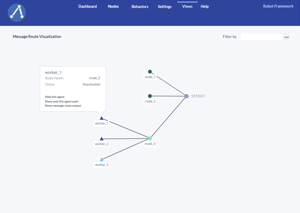
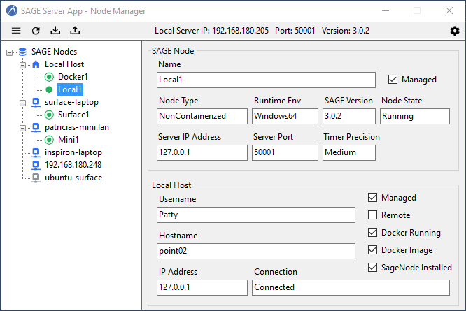
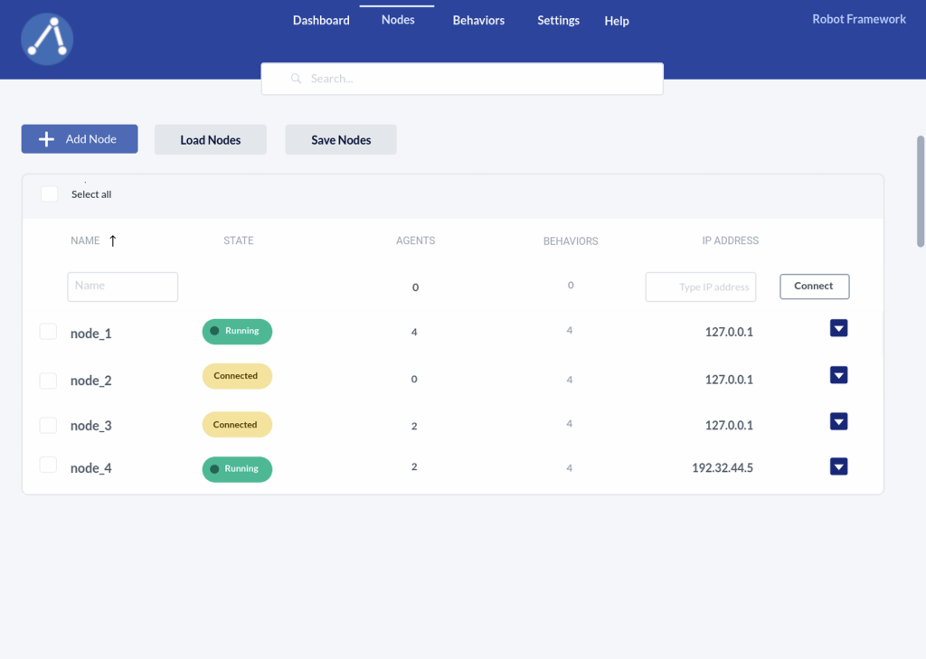
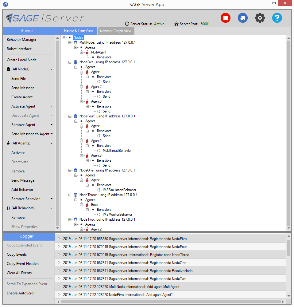
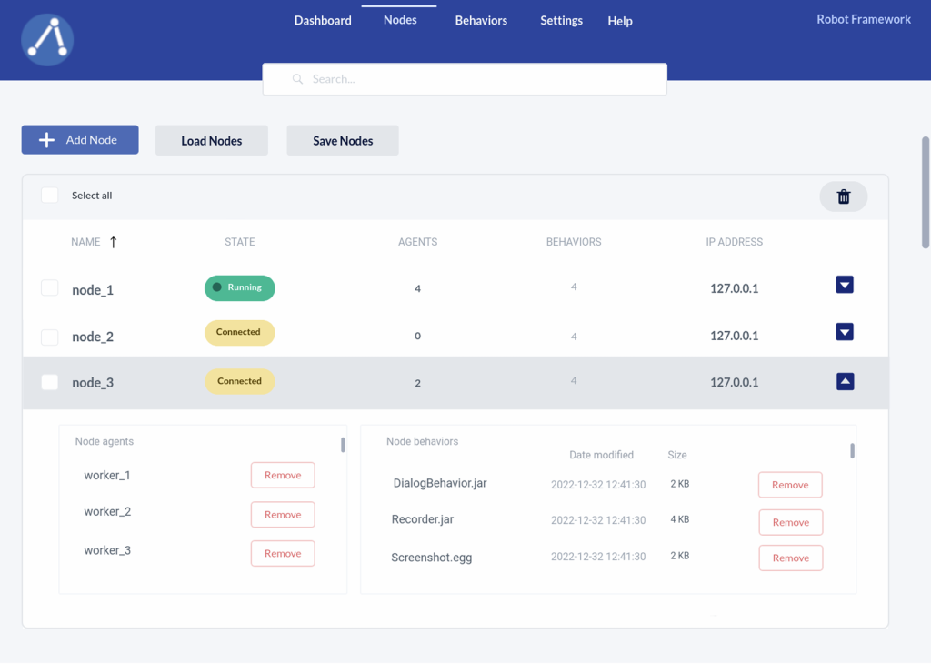
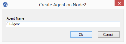
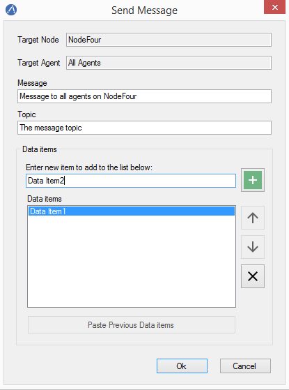
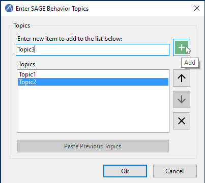
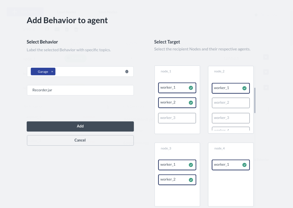
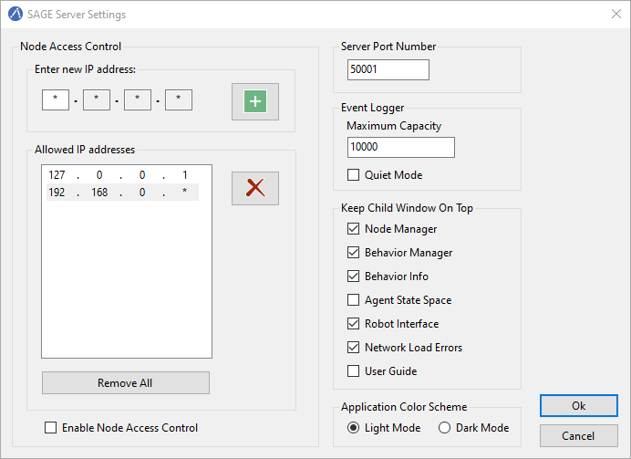
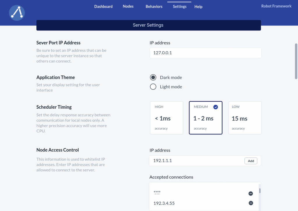
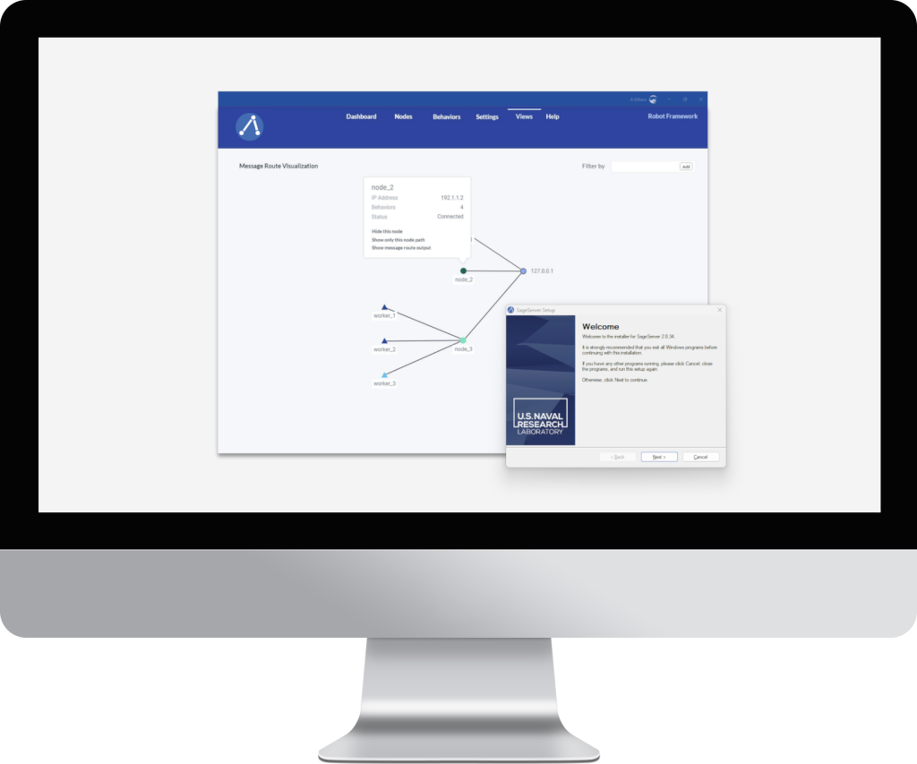
Following close collaboration with engineers and testers on additional functionalities like “Message Visualization” and “Docker Integration,” I presented my design, complete with a list of components and an interactive prototype for the team to evaluate. Below, you’ll find high-fidelity screenshots of the final design for comparison against the original product.
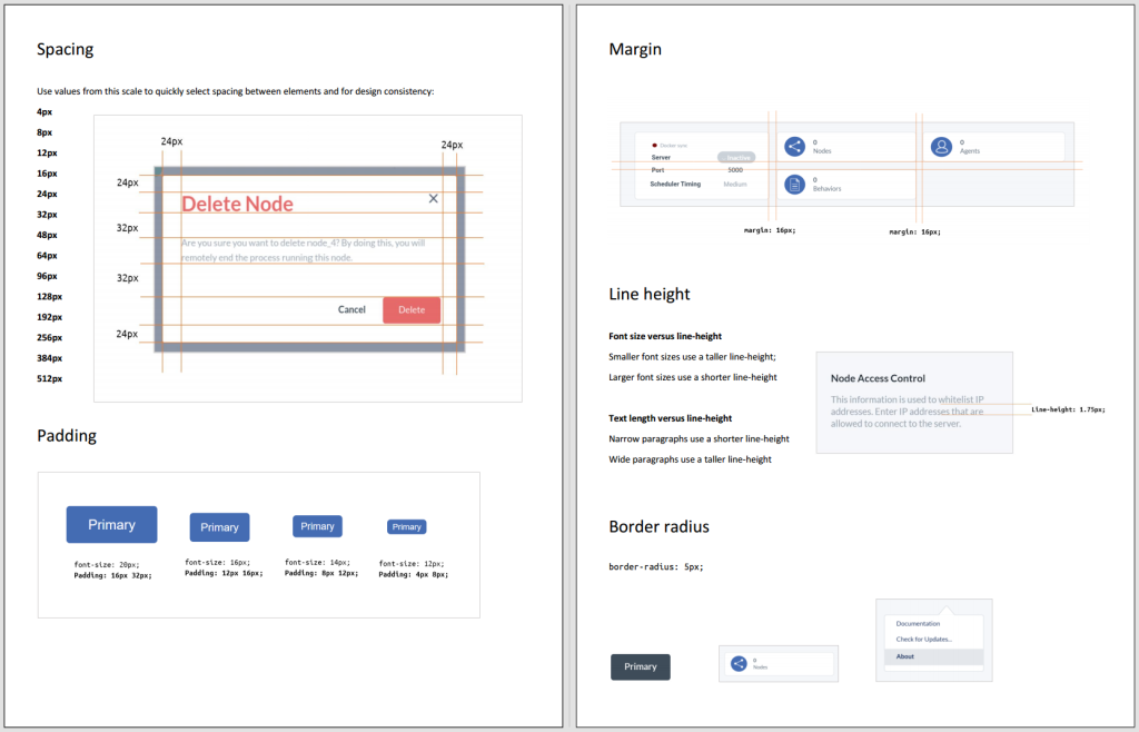
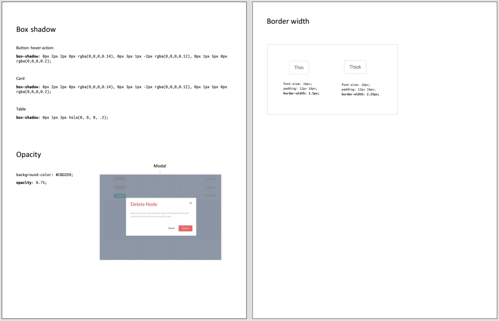
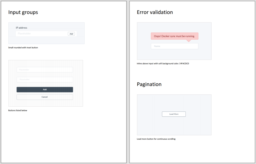
Design System
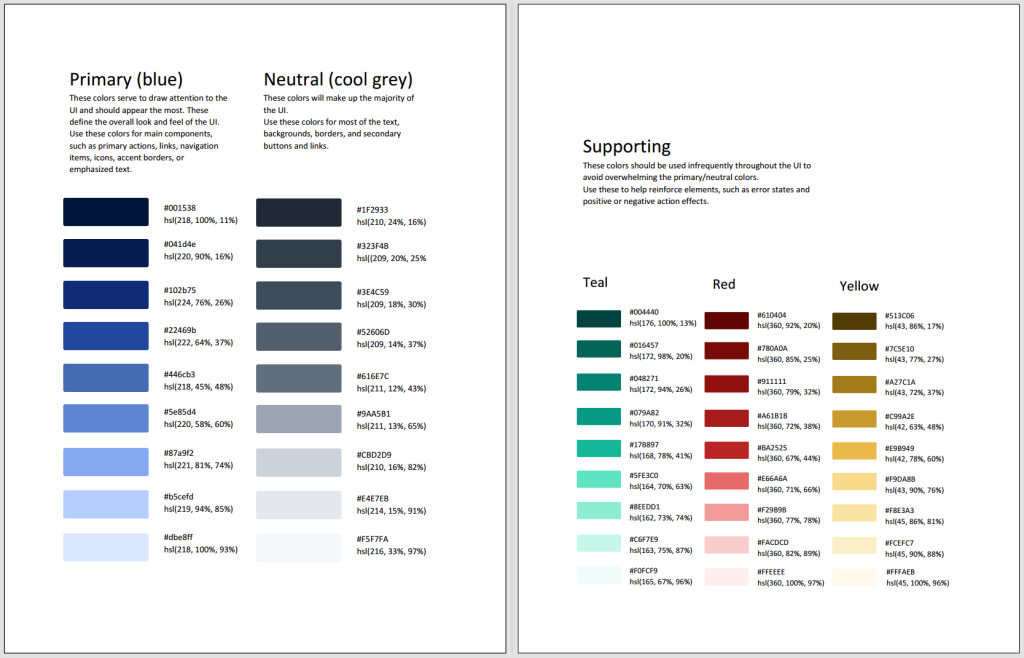
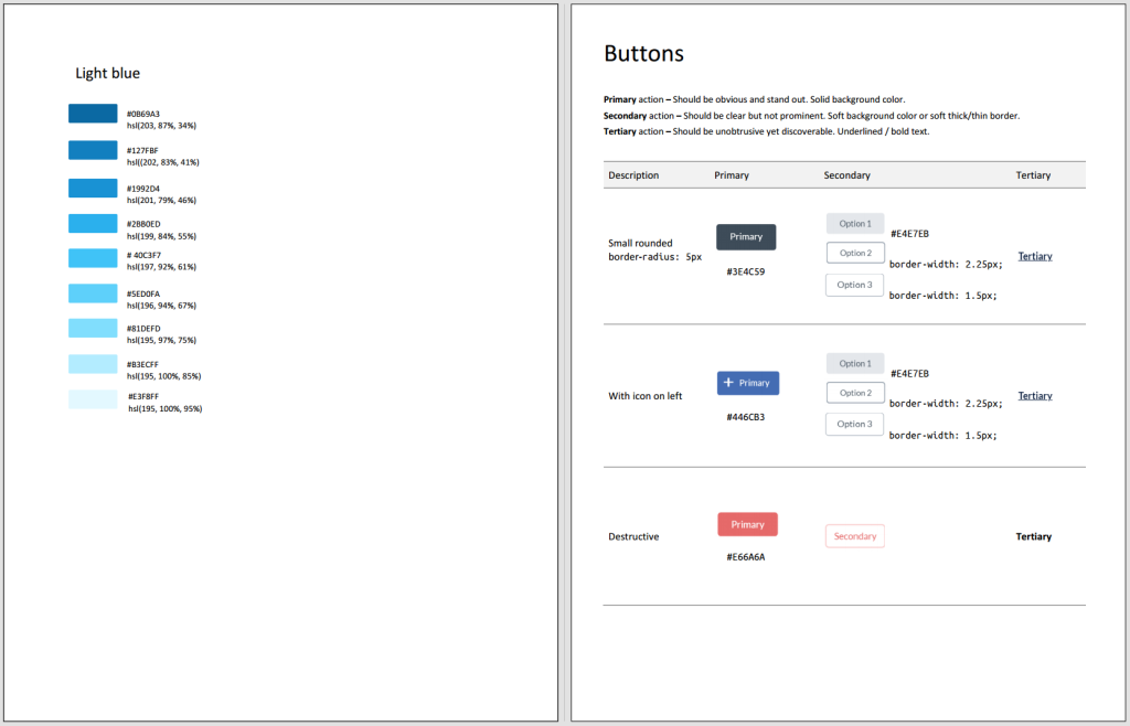
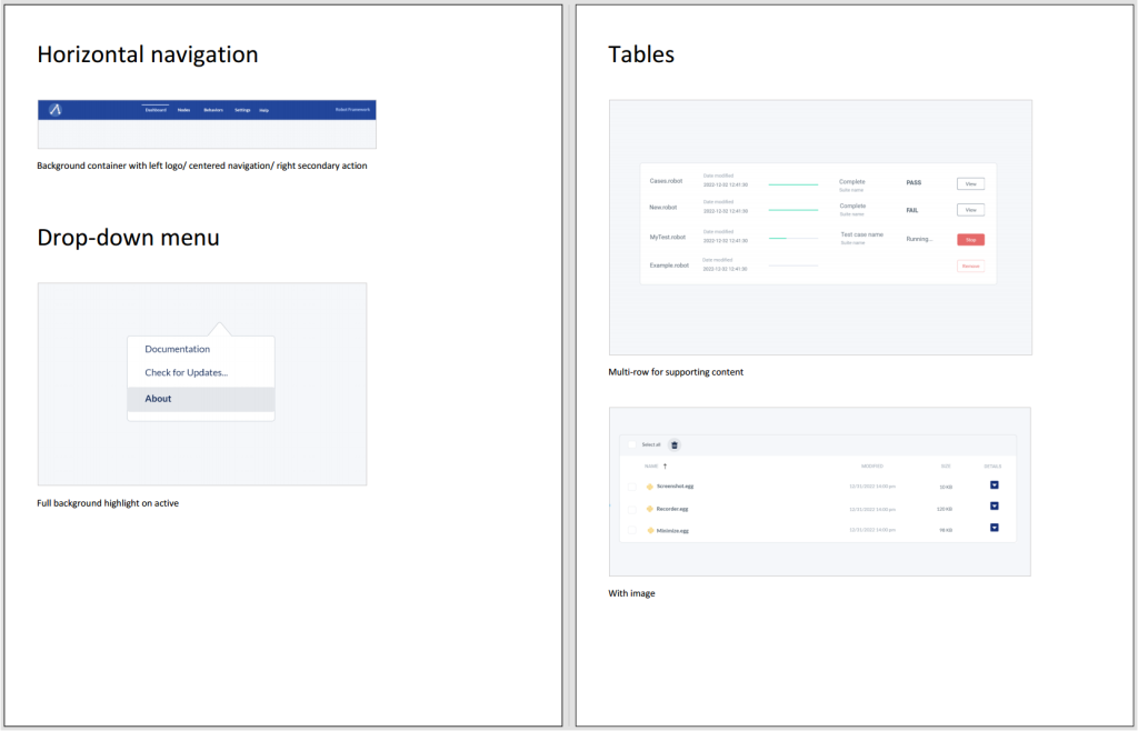
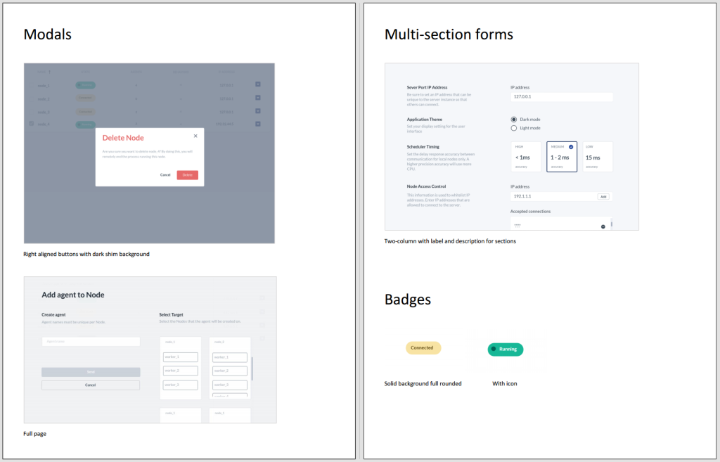
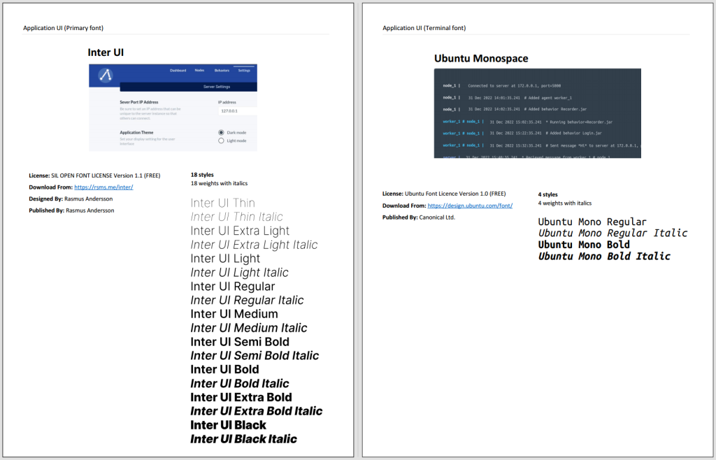
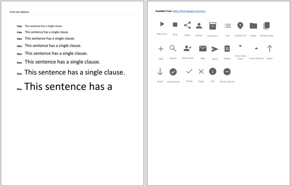
This task involved creating and documenting a design system aimed at standardizing components and color schemes for developers working on the application. One aspect I explored was integrating elements from the official government design system, the U.S. Web Design System, which offers guidelines for designing government websites, and adapting them for use in a dedicated desktop application.
What’s Next
With limited time on the project, my focus was on prioritizing the interaction design. However, given additional time, I would have welcomed the opportunity to refine some of the visual designs.
I enjoyed coming up with ideas and new approaches for this project. There was ample opportunity for creativity, and this was evident in the final design I crafted. I effectively streamlined numerous user interactions and presented content in more accessible terms, catering to less technically inclined customers. Lots of feedback on the design was positive, and I’ve been informed that once technical challenges are overcome, the design will serve as the cornerstone for the product.
