A web app for aspiring counselors to manage their caseload and track their training hours.
Overview
In 2019, I launched the first version of Fojhio Timesheets—a lightweight responsive web-application tailored for counseling professionals, explicitly designed for desktop-first users with different user needs. Due to the increasing demand for mental health services, there has been a corresponding rise in the counseling profession. In response, I aimed to transform a product typically marketed under an enterprise software model into a more equitable design suited for direct-to-consumer business operations.
Date
February 2019 – January 2021
Skills
Product Strategy/Roadmap, Feature Requirements, Backlog Prioritization, Copywriting, HTML/CSS, Cybersecurity, User Personas, User Journeys, Competitive Audits, Prototyping, Moderated Usability Test, UX Writing
Role
Founder and Creative Director / Lead Designer
The Problem
A minimum of two years is required to complete a specified number of residential hours for state licensure application. Develop a more efficient and user-driven design for counselors to log multiple hours at once, recognizing that not all service hours are recorded on the same day.
The Goal
The time tracking software will allow counselors to efficiently monitor and oversee their training hours through licensure. This will impact how counselors monitor their progress towards licensure requirements, as it provides them with a visual representation of the hours accumulated across different service criteria. Effectiveness is gauged by the speed at which users can input numerous hours.
01
Understanding the user
Interviews
Empathy maps
Personas
Competitive audit
02
Starting the design
Sitemap
Wireframes
Lo-fi prototype
Usability study
03
Refining the design
High-fi prototype
Accessibility
Data & Privacy
User Research
Counselor professions necessitate at least a master’s degree. Knowing this, the product was to be developed to address the needs of two distinct user groups: graduate students who may need to monitor hours for practicum during their schooling, and individuals who must track hours for state licensure purposes.
However, prior to delving into understanding my users, I needed to define the project scope and establish any non-functional requirements such as cost and time. Familiarizing myself with these constraints enabled me to shift my focus from what I “should do” to optimizing for what I “can do.” As a result, I decided to prioritize user group #2.
Target users #1: Students ages 18 and older planning to enter the counseling profession in a variety of human service settings.
Target users #2: Users who have graduated and are aiming for state licensure.
Interviews and pain points
I interviewed five individuals who were currently registered as associates with the goal to understand their current experience for managing their caseload hours. It was important that these questions remained opened-ended, relevant, clear and unbiased, and allowed for follow-up questions.
“I currently track my hours on Excel and transfer them to the state’s form, but it is frustrating when I make a mistake and have to redo an entire form.“
— APCC candidate
Many participants used various methods to track their hours—whether through Excel sheets, paper records, or by sticking with the enterprise software previously mandated by their school’s program. However, when it came to aligning those hours with the state’s licensure requirements, many expressed frustration or confusion due to the multitude of criteria involved. Moreover, many participants did not record their hours same day and would sometime have to backtrack.
Pain points:
- Keeping up with the requirements criteria is difficult.
- Having to manually calculate the number of hours completed is time consuming.
- Having to backtrack to find previous hours can be stressful.
- It is easy to forget to log hours within a specific timeframe.
Insights:
- Each state has a different set of licensure criteria that has to be managed and scaling the product will play a key role in design.
- Users want to see progress being made toward their goal. Many felt that it could provide a sense of encouragement.
- The product can provide a faster way to search through hours.
- The product should be simple and quick to use. Making use of preset categories, a mobile option, or daily reminders are some possible solutions to encourage timely input.
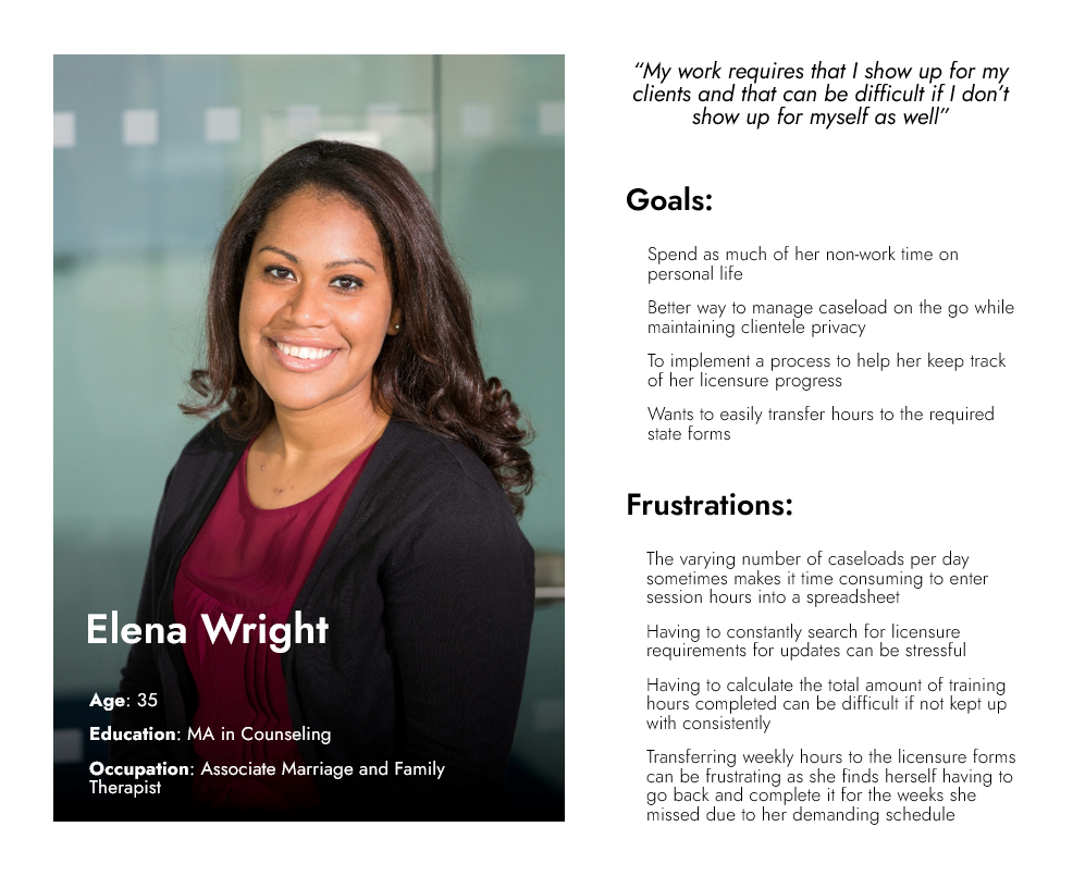
Personas
In order to provide clearer direction for the design efforts and foster empathy towards the users, I refined the interview findings and developed one of the following personas:
Competitive audit
As a business owner, I recognized that conducting market research on existing products to understand their offerings would be a crucial step in the ideation process. This approach not only aids in brainstorming additional product functionalities but also facilitates identifying business opportunities. As it turns out, there are only three direct competitors in the market making this an ideal business opportunity due to low competition in a growing industry.
*It is important to note that the initial analysis was completed in 2019, and it’s possible that competitors’ offerings have evolved since then.
Competitive audit report:
01
Audit goals
Compare the sign-up process for each competitor’s app as a new user and compare the recording experience for logging and tracking daily hours.
02
Key competitors
The first key competitor is Time2Track, the first clinical hours tracking software brought to the market in 2003 and ran by a single owner who was a former counselor. Time2Track was recently purchased by software education company, Liaison International, Inc, in 2018.
The second key competitor is TrackYourHours, a clinical hours tracking software that specifically targets the California market with a unique value proposition of tracking California’s licensure requirements.
The third key competitor is PsyKey, a clinical hours tracking software that specifically targets Psychologist and PhD candidates. They have a unique value proposition of allowing its users to create custom goals. However, there have been no updates since 2013 and their mobile app was removed from the app store.
03
Type and quality of competitors’ product
Time2Track is a web-based only application with the slogan “The easiest way to track, verify, & manage experiences”. From a technical standpoint, the application is very dated with no website responsiveness or mobile offering. The UI is not modernized, and they only accept one form of payment. There is no accessibility taken into account. However, since they were the first to market, they have strong footing with various schools working as an enterprise software model. The registration process requires inputting Personal Identifiable Information (PII).
TrackYourHours is a web-based application with a very similar dated visual. However, while the UI could use some work the user-flow felt a little more intuitive than its competitor as they leaned more into users visualizing their progress. They came into the market in 2007 and specialize in California licensure and have not expanded into any other state markets since. They only offer one form of payment option with no accessibility features. They have a proven business model that works, as California is the one market that their competition has the least presence in. This is most likely due to them making the tracking of one’s licensure process easier in that state.
Psykey is a web-based application that was designed as desktop-first and later transferred to mobile devices. There has been no blog activity since 2013 and no updates to their website, UI, or features.
04
How do competitors position themselves in the market?
Time2Track markets itself as a B2B and B2C software application. They were purchased in 2019 by a well-known software education company that is known to operate in the enterprise software model space.
TrackYourHours markets itself to customers primarily in California. They target aspiring LMFT, LCSW, and LCPCC candidates and the application reflects this: applying California Board of Behavioral Sciences regulations to your hours.
Psykey markets itself as a B2C software application targeting the clinical profession. However, out of the three competitors they seem to be less active in the market. An example being that they still heavily advertise their mobile app which is no longer present in the app store.
05
Strengths
Time2Track:
- Has a large market presence due to being first to market.
- Recently purchased by a large company.
- Inclusive form options.
- Robust documentation.
- Offering a trial-period.
- Supervisor integration.
TrackYourHours:
- Visuals for licensure progress.
- Has a niche targeting a single state’s licensure program allowing users to automatically keep up with updates and regulation changes.
- Offering a 30-day trial-period.
- Can download your hours automatically generating them in the licensure forms format.
- User referral program.
- Responsive web-based application that allows access to some features on mobile.
PsyKey:
- Allows users to create custom licensure goals.
- Allows users to upload and transfer hours.
- Summaries and graphs of hours.
- Schedule reoccurring appointments.
- Tracking client information is optional.
06
Weaknesses
All three competitors seem to suffer from the same major weakness of being designed and built in the early 2000’s and not modernizing with the current technology landscape.
Time2Track
- Dated UX and UI.
- Calculates total hours through text only.
- Not accessible on mobile device.
- Forms have too many options and are difficult to navigate.
- Only one form of payment option and it’s not PayPal or Stripe.
- No way to schedule repeating appointments.
- Too many required fields for information that seems irrelevant. Comes off as if its sole purpose is for data collection.
- Have to navigate from one window to another in order to input hours.
- Not clear on where hours should be inputted.
- No consideration for accessibility.
- Have to commit to yearly subscription.
- No robust search or filtering options.
- Can’t edit hours without deleting it.
TrackYourHours
- Dated UX and UI.
- Only one form of payment option and it’s not PayPal or Stripe.
- Calculates total hours through text only.
- Not optimized for mobile device.
- Only operating in the state of California.
- Have to navigate from one window to another in order to input hours.
- No consideration for accessibility.
- Have to commit to yearly subscription.
- No robust search or filtering options.
- Can’t edit hours without deleting it.
Psykey
- Dated UX and UI.
- Only one form of payment option and it’s not PayPal or Stripe.
- Little to no customer support.
07
Gaps and opportunities for Fojhio
- Provide a modern UX and UI dashboard for users.
- Provide quick and easy way for users to input hours, services, and supervisor from a single screen.
- Offer multiple payment option types.
- Replicate TrackYourHours’ California licensure form integration process across other states.
- Focus on visuals over text.
- Make it mobile friendly.
- Provide rewards or perks for users.
- Offer monthly payment plan in addition to annual option.
- Provide easy way to save reoccurring appointments.
- Provide easy way to filter through recorded hours.
- Provide a way to edit hours in case of mistake.
Design
The competitive audit significantly enhanced the ideation process by contextualizing the information and insights gathered from prior interviews. I had to start designing for not only the application itself, but for the website content and the user documentation as well. This provided me with an opportunity to come up with as many ideas as possible without concern for feasibility. Below is a result of one of the rapid sketching activities completed for the application’s dashboard component.
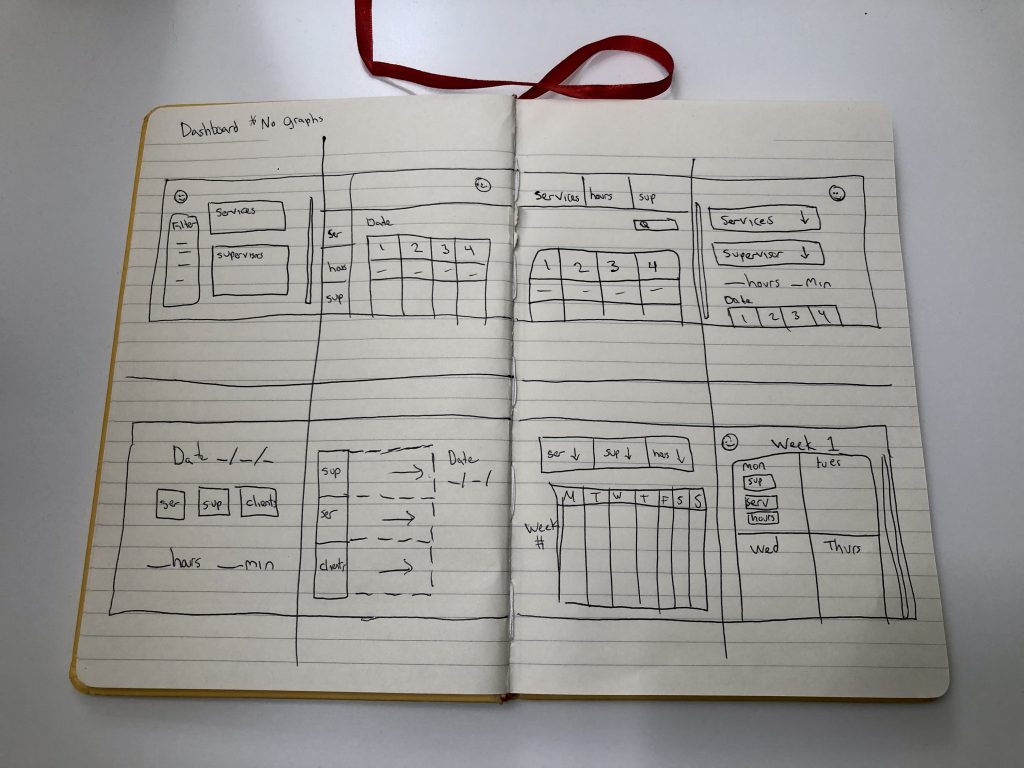
During these ideation activities, I really got a chance to dive into coming up with the brand identity as this was a chance to distinguish Fojhio from its competitors.
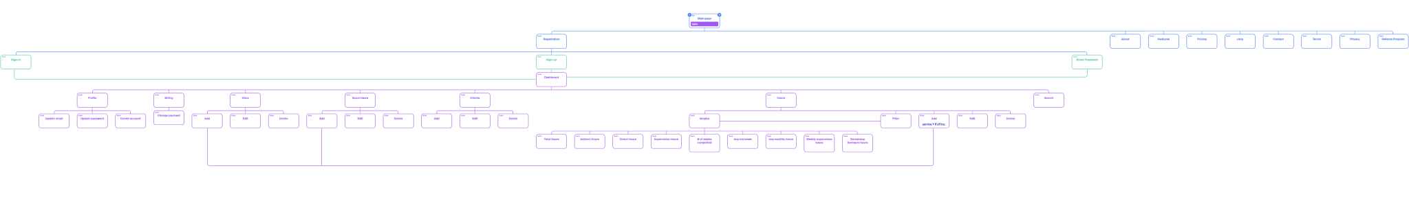
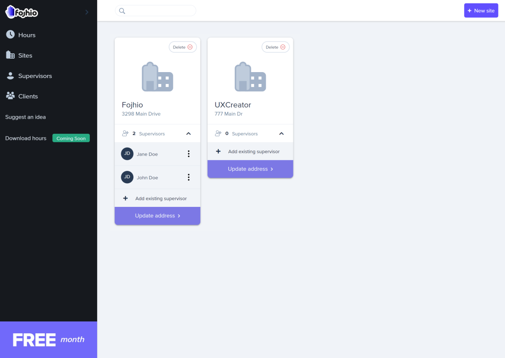
User flows and Sitemaps
Before getting into wireframing and prototyping, I needed some basic idea about how the users would navigate through the product —what actions will users take in the product? what decisions will users make? and what screens will users experience before and after taking action or making a decision?—and achieve their goals. Upon mapping the sequence of users’ experiences for certain basic functionalities, I came to the realization that I needed to make a compromise regarding what would be developed in the initial iteration versus what should be placed into the backlog. For example, allowing a user to transfer there hours from another tool would be a great solution for market penetration; however, the development work required for this would prove too costly if I were to hire a developer within my time constraints. Moreover, the number of edge cases present would further delay testing. In the end, this process helped guide the product roadmap including requirements gathering.
Eventually, the following information architecture was identified and ready for prototyping:
Prototyping
During the early stages of prototyping, I generated several design iterations to pinpoint areas for enhancing the user experience and implementing refinements. My approach was centered on creating a user-centric design that not only catered to the application but also emphasized the community for which the product was intended. My goal was to create a UI that was contemporary, drawing influence from Material Design, and a UX that offered simplicity from the registration process to recording training hours. The design also needed to be adaptable for mobile devices.
My wireframes eventually evolved into a low-fidelity prototype. However, considering budget and time constraints, I opted to present a medium-fidelity prototype to potential users during testing. This decision aimed to reduce user confusion and obtain more precise feedback results.
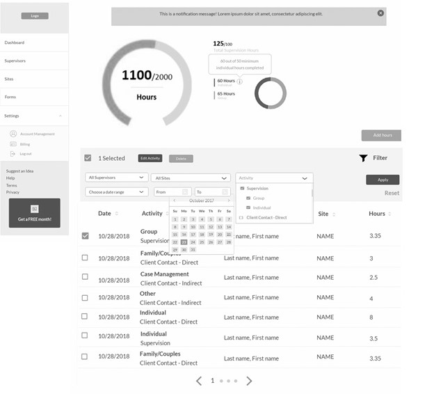
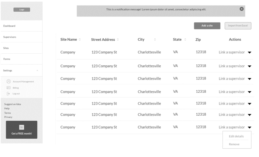
Mid-fi prototype:
Usability study
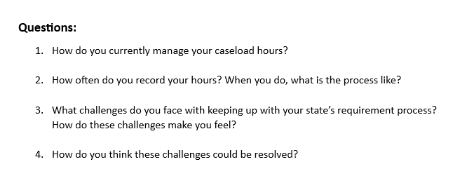
Research plan:
Research questions
How long does it take for a user to log 2 indirect hours and 2 supervision hours in a single user session.
What can I learn from the steps users take to search through their logged hours.
What can I learn from users’ interpretation of the graphs presented.
KPIs
- User error rates
- Time on task
- System usability scale
Methodology
Think-aloud Cognitive Walkthrough
Three participants complete the tasks on their own. Each participant completes a questionnaire on their experience.
Each session will last 20 minutes, and will include an introduction, a list of tasks, and exit survey.
Participants
Participants are people who are currently registered in the state of California as either an APCC, AMFT, or ACSW.
- Participants don’t have to have prior experience with online timesheets.
Actions
Task 1: Ask user to add 2 indirect hours of any type.
Task 2: Ask user to add 2 supervision hours for a group session under supervisor Jane Doe.
Task 3: Ask user to search for all recorded indirect hours.
Task 4: Ask user to update the recorded indirect hours from 2 hours to 4 hours.
Task 5: Ask user to filter recorded hours by supervisor.
Task 6: Ask user to delete any site created.
Task 7: Ask user to delete all recorded hours
Round 1 findings:
- Many users thought the graphs and visuals should be a larger focus for recorded hours.
- Many users misunderstood the use of the filter option as a way to search through the data.
- Some users found applying a filter option confusing to navigate.
- Some users were confused by the term “Activity” and did not initially associate it as being “type of hours being recorded (direct, indirect, etc.)”
- Users rarely used the notes section.
- Users often failed the step to delete a site and felt the delete feature should be an exterior feature and not hidden under a dropdown menu.
- All users thought adding new hours were usable and easy to learn.
- Users thought that any previous hours logged under a supervisor would still be visible even after deleting said supervisor.
- Users liked being able to add new supervisors, sites, and hours from the same screen.
Modifying designs
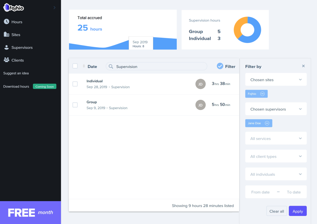
After gathering notes from the usability test, I analyzed the data and pinpointed any recurring patterns and themes that detracted from the user experience. Moreover, the open-ended question at the end of the surveys proved highly beneficial, as they revealed a design aspect that I had initially overlooked: the necessity for some users to track client demographics as part of the licensure process. I prioritized these insights and incorporated them into new mockup designs.
For instance, I introduced a dedicated search bar and revamped the edit menus, as well as redesigned the filter window. This was necessary because they bore a visual resemblance to the original filtering option, which posed navigation challenges during the usability test. Furthermore, I placed greater emphasis on visuals, not only for graphical information but also to find more effective ways of visually presenting data within the table structure and management screens for supervisors, sites, and hours.
Before
After
Accessibility
Accessibility considerations, particularly regarding color blindness, significantly influenced the choice of color scheme for the application. Recognizing the importance of graphical information in the product, I ensured that the graphs presented no issues for users with color vision deficiencies.
Respecting User Data & Privacy
In the final iteration of the design, I incorporated cybersecurity best practices, including input validation, automatic logout for inactivity, data minimization, data anonymization upon account deletion, data masking, and password hashing.
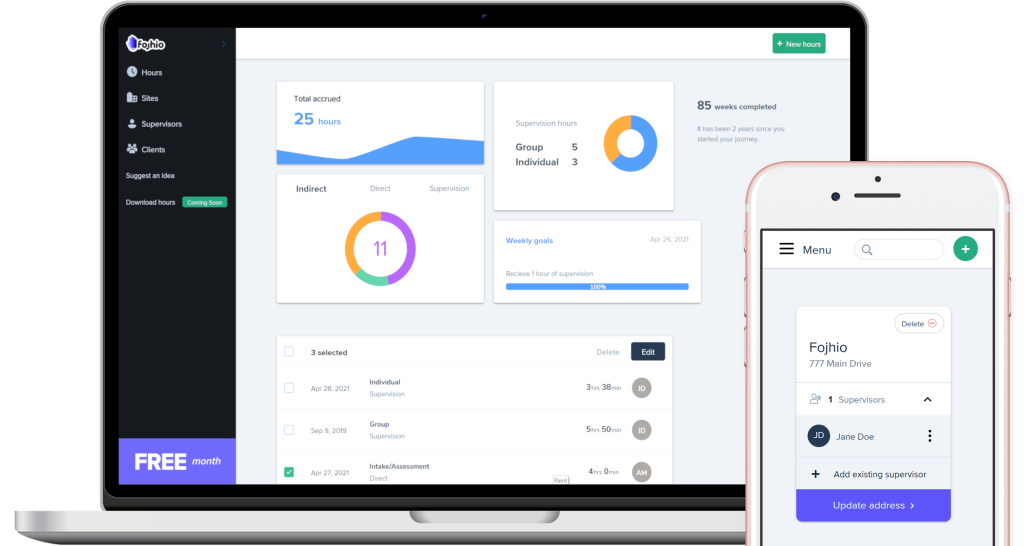
Final Iteration
After months of design and testing, I successfully built the initial version of Fojhio Timesheets. Now, all the documentation I prepared and the design files I created were ready to be forwarded to the developer I’ve enlisted for the project. This collaboration would enable us to transform this design into fully functional software.
Moving forward, my role had shifted more towards that of a program manager, focused on ensuring that development goals and timelines are being met, as well as task allocation and backlog maintenance.
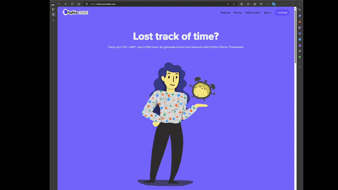
I officially launched the product, and the demo application remains active. Please explore the website as a new user and remember to log in to experience the product. Additionally, it works on mobile devices as well!
What “was” Next
Future Steps
By the end, I gained a deep understanding of my end-users compared to when I initially started the design process. I had planned numerous quality-of-life improvements and features, many of which unfortunately had to be cut due to cost constraints. This company was self-funded and driven by my passion and opportunity. I had hoped to further develop the product to address additional pain points uncovered during my role as a UX researcher. The next iteration of Fojhio was intended to incorporate some of the following enhancements:
State licensure requirements integration:
After initial user research, I had envisioned integrating various state regulations and requirements into the tracking process. Back in 2019, my initial competitive analysis revealed that a competitor, TrackYourHours, had established a successful business model focusing on California as its primary market. By 2022, they had expanded to two additional states, indicating an ongoing market demand as of 2024. However, this particular feature had to be placed in the backlog due to the technical complexities involved in implementing a system capable of managing multiple professional requirements per state. Initially, I considered starting with the state of Maryland after conducting a demand per service market analysis for each state. Unfortunately, any modifications would necessitate additional backend development.
Enhanced accessibility features assisting visually impaired users:
I aimed to integrate additional accessibility features to cater to visually impaired users, particularly by optimizing for screen reader technologies. Recognizing that my final designs heavily relied on visuals, I sought ways to ensure support for these users.
Enhanced keyboard accessibility experience:
I planned to improve keyboard navigation and tabbing across the user interface. This required additional development and testing time. As it stands, the product is not 100% keyboard accessible and that is a major issue.
Download hours to forms:
This feature was initially slated for design to address a pain point identified during my initial user research. To emphasize its importance, I even incorporated a button placeholder on the dashboard. However, due to technical intricacies, it had to be backlogged for later development.
Customized graphs:
This feature aimed to empower users with greater control over the graphs displayed on their dashboard. Users would have the ability to hide or show graphs as desired and rearrange their positions within the window. Additionally, this functionality would have enabled the design of new graphs tailored to present information based on more specific criteria, such as the number of hours per client, among others.
Improved UI:
I find pleasure in UX and design, particularly in crafting interactions that enhance user experiences. Therefore, I intended to enlist the expertise of a user interface (UI) specialist to elevate the visual aspects, while I remained dedicated to refining the UX design and marketing of the business. Implementing improved visuals, such as incorporating actual site images, could have greatly enriched the overall user experience.